Every year around the end of the year, paint manufactures, designers, fashion editors, and printers all announce what they believe will be the color or colors of the upcoming year. These selections are derived from many sources including art, architecture, museums, gardens, travel, fashion, food, and cocktails; even pop culture, politics, technology, and social issues can influence these color selections.
In 2016, simple, understated white hues like Benjamin Moore’s Simply White and Sherwin Williams’ Alabaster White that went with everything were trending, and are still great choices for a bright neutral paint.
In 2017, we saw a shift to darker neutral shades. Deep greyish blues and purples, along with some warm neutrals and even a bold yellow made the list.
The forecast for 2018 is even deeper and bolder colors. The Pantone Color Institute predicts intense colors over pastels for the coming year. “Intense colors seem to be a natural application of our intense lifestyles and thought processes these days,” says Leatrice Eiseman, Pantone Color Institute executive director.
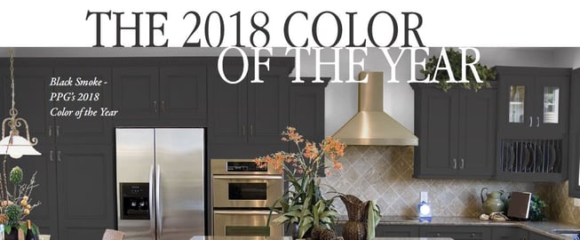
One of the first companies to release their prediction was PPG Paints, who for the first time in history picked a black paint as their color of the year. PPG named Black Flame as their Color of 2018 and they describe it as an “unprecedented, statement-making black with deep tones of indigo.” This dark shade evokes feelings
of privacy and classic modernism.
You can expect to see more announcements in the twilight color palette like dark blues, greens, and charcoal tones paired with the ever-popular warm neutrals like golden yellows and muted pinks.
But you won’t only see dark hues in 2018. In Sherwin Williams’ Colormix® Forecast 2018, they predict next year will be about three bright color palettes which they've dubbed Unity, Connectivity, and Sincerity. All of these combinations are surprising and guaranteed to pack serious happiness into a room.
Behr announced “In the Moment” as their 2018 Color of the Year. Behr says, “This cool, tranquil spruce blue is inspired by nature and is a soothing, restorative coalescence of blue, gray and green.”
Buyers can think about using these bold saturated colors in smaller doses, such as for an accent wall, in a niche or on the ceiling only, rather than on all four walls in a room. Paint manufacturers also release of palette of several trending, complimentary colors every year, many of which include more neutral shades of white, grey, and tan.
Homeowners are in no way expected to change the color scheme of their home with each passing color trend. Where these selections can be useful, however, is when there's a particular color being touted that you really like. It becomes much easier to find furnishings and decorative accessories that coordinate with the favorite hue because it's trending.
Another interesting aspect of the Color of the Year announcements are the names of the hues themselves.
The process of naming these colors in rigorous and well thought out, often involving color specialists, marketing professionals, and lawyers to name a few contributors. Where you once saw a shade named Bright Red, today you'll see a similar red named Heartthrob or Spirit Warrior. In today’s competitive paint market, manufacturers want consumers to connect with their colors. Color names can typically be divided into four categories: visual, geographical, emotional, and experiential. Studies have shown that paint names are often the ultimate tie breakers with so many similar color choices on the market.
So, next time you’re shopping for paint colors, consider what’s trending and how those colors and names make you feel. Want to learn more? Visit:
www.ppgvoiceofcolor.com
www.sherwin-williams.com
www.behr.com
Are you interested in hot real estate topics, tips and trends?
Click below to subscribe to our blog!